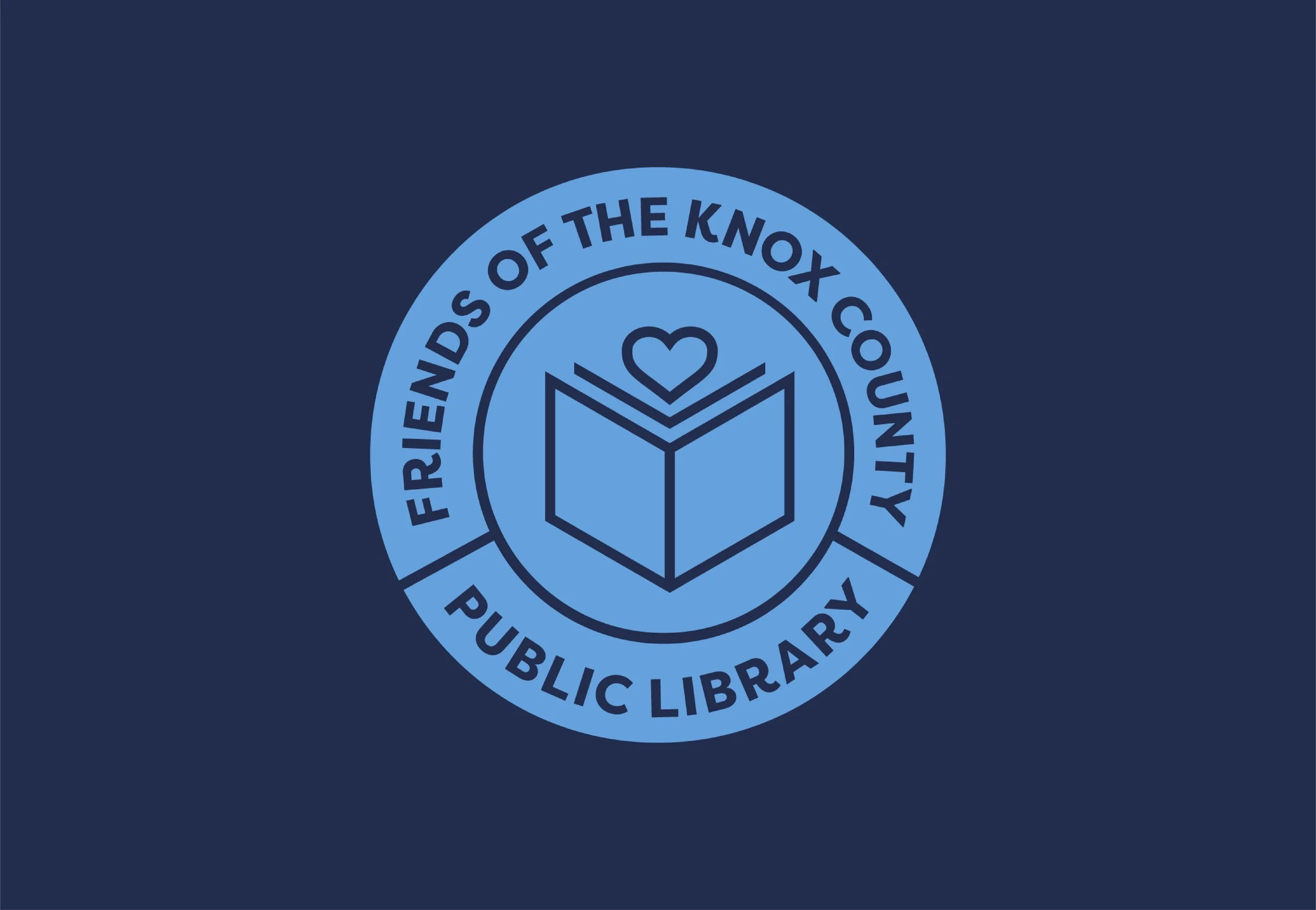
Friends of the Knox County Public Library is a non-profit that raises money for library services & distributes free literature to Knox county schools. The organization was eager to gain new, younger, and more diverse members than previous years.
I had the opportunity to redesign their identity while interning with Robin Easter Design.

Inspiration:
Friends of the Knox Library wanted to re-energize the brand and attract fresh faces, without alienating the existing members that made the organization a valuable piece of the community. The new design references the kinds of library stamps used in libraries for centuries, towing the line between familiar and new by embracing a clean modern look.


Logo:
The logo carries over the same book from the previous version, this time instead of a solitary face it is accompanied by a heart, representing the love spread by Friends of the KCPL and the love for reading shared by its members.
Typography:
Filson is a friendly and modern sans serif that was chosen for it’s typography flourish on the R letterform. Georgia, the serif typeface, was chosen for its timeless bookish feeling and its readability at small sized within a lot of body text.