
Spark
Spark approached my senior branding class with an open mind and asked us to stage a design intervention to help them reinvigorate their organization
Spark is a Knoxville based non-profit organization serving disabled people in East Tennessee. Although Spark provides radical, selfless work to the community, their donation based budget leaves marketing and branding to be an afterthought.


Logo: To improve legibility across different background colors the old logo was updated to be a single color. A mark of the signature “A” was added aswell.


Wanting to build upon their existing identity to remain familiar, I revamped their existing assets to move away from muted, cool tones and to brighter, colors reflect the fun energetic energy of the organization. I selected new colors by referencing the brightly colored mural painted on the exterior of the Spark headquarters. Sparky, the existing mascot for Spark, got some small cosmetic changes herself to improve approachability.


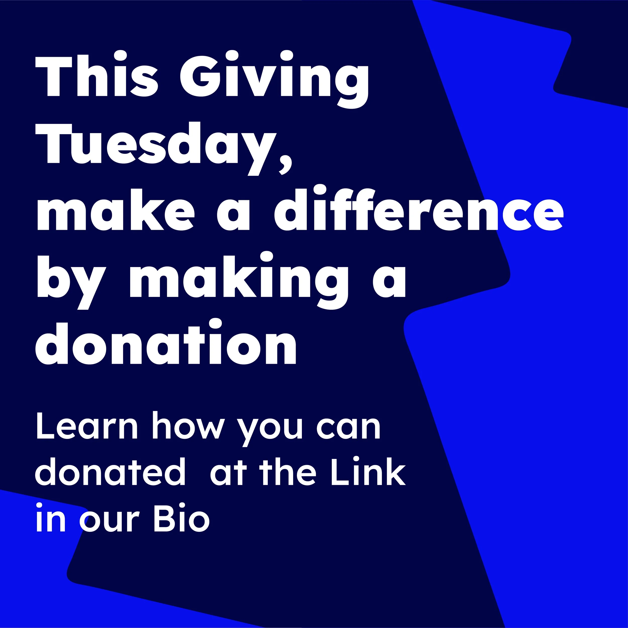

Instagram Carousel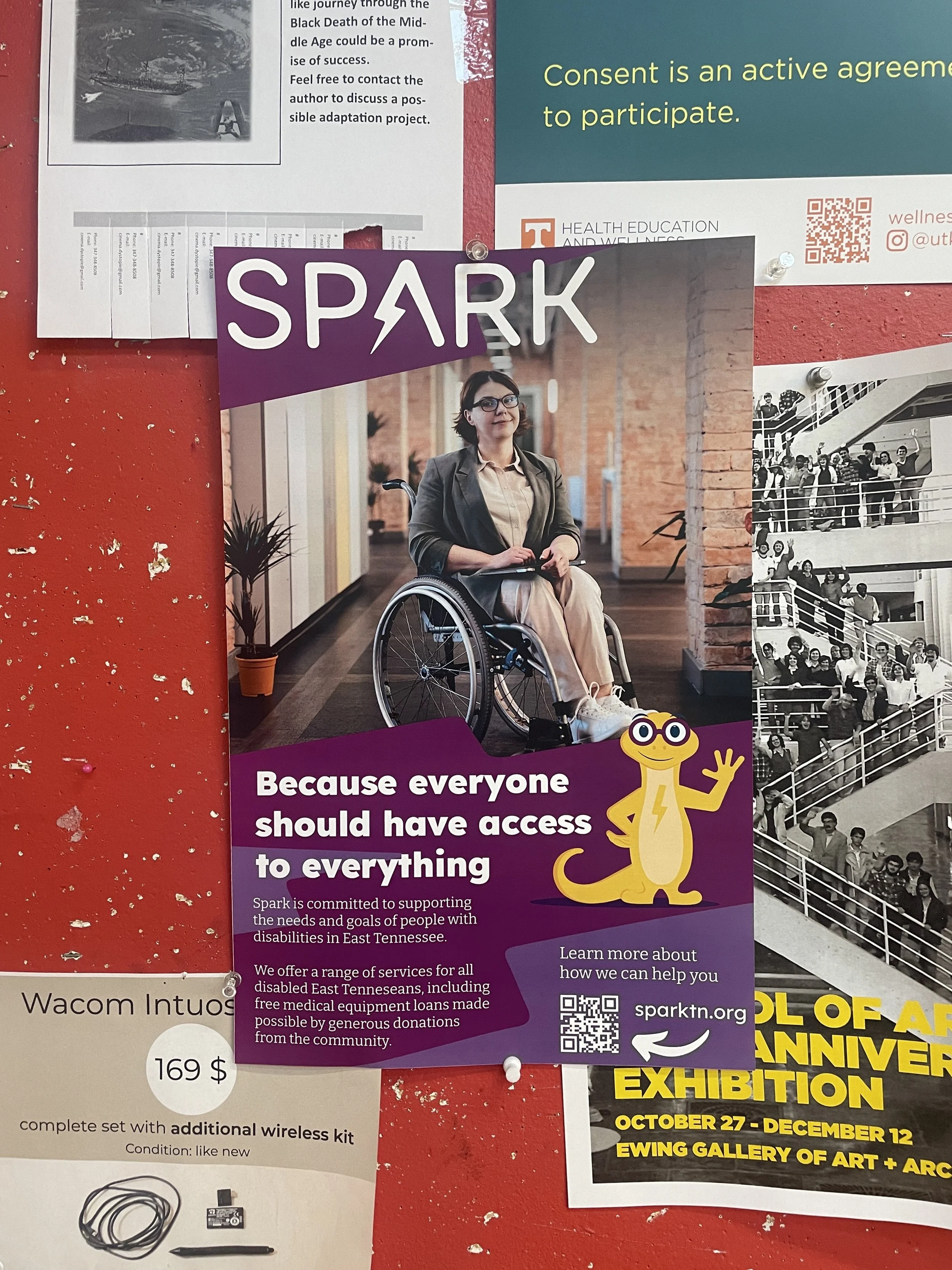

In effort spread the word about Spark and add a visual credibility, I created a series of editable flyer, poster, and social media templates to empower Spark to promote their events while being budget conscious. Templates were created for Instagram posts, stories, as well as a larger digital graphic to be used on facebook and twitter.
Flyer Formatting 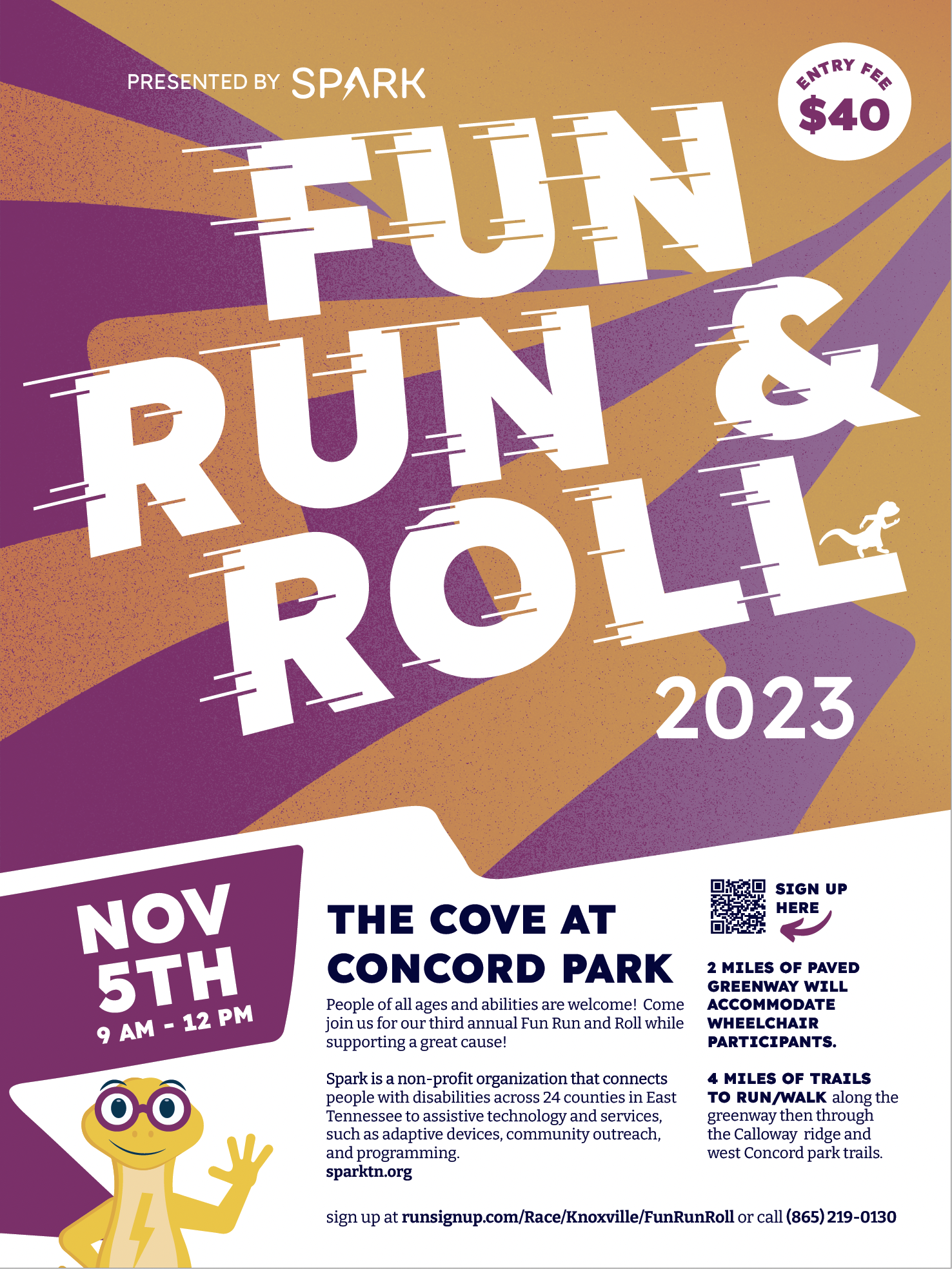


Fundraising: The brand was also extended into a sub-brand for one of their largest annual fundraisers, the Fun Run and Roll.